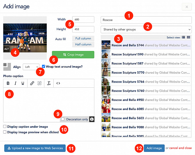
Images
Web Style Guide
Image Sizing Best Practice
Landscape (horizontal) images work best in most cases and should be added as full-width with no alignment or text wrapping. In some situations, such as a person’s portrait, vertical images can be used with text wrapping but should not exceed approximately 1/3 of the containers in width.
Image Styles
There are several styles that can be applied to images after they have been added to a page that can affect their appearance and positioning. To use these styles, select an image and choose one of these options from the Formats dropdown in the toolbar.
Large Image with Caption
Select an image with a caption and “Display caption under image” checked, then apply this style. The image will be styled in a wide block with the caption in a blue box on the right. Note: the caption text will not be visible during editing.
Example:
Outset Image Left/Right
The “Outset Image Left” and “Outset Image Right” styles can be applied to make an image break out of its container on either the left or right side.

Here is an example of an image with the “Outset Image Left” style applied. This image is also set to align: left and wrap text in the image properties.

Here is an example of an image with the “Outset Image Right” style applied. This image is also set to align: right and wrap text in the image properties.
Example:
The “Outset Image Left” and “Outset Image Right” can be combined to create an image that breaks out of its container on both sides. This only applies to images that are set to align: none and no text wrap. Make sure the width of the placed image is wider than its container. 1000px is a good default.

Mobile Overrides
In some situations, it may be desirable for images to have different alignment settings on smaller screens. There are some special styles that can be applied to images to override any alignment set in the image properties. To use these styles, select an image and choose one of these options in the Formats dropdown. Note: These styles only take effect at the mobile breakpoint.
- Mobile Align Right - used to force an image to align to the right, with text wrap, at mobile sizes, regardless of whether left, center or none was selected in the image properties.
- Mobile Align Left - used to force an image to align to the left, with text wrap, at mobile sizes, regardless of whether right, center or none was selected in the image properties.
- Mobile Align Center - particularly useful for centering an image, at mobile sizes, that was set to align: left or right in the image properties. This option also removes any text wrapping that was applied.
- Mobile Align None - used to remove any alignment that was set in the image properties at mobile sizes.
Example:

This image is set to align: left with text wrapping in the image properties, but it has the “Mobile Align Center” style added.
Resize this window or view on a mobile device to see how the image appears centered.

