Full Width Headers
Web Style Guide
Contents
- Home
- Text
- Images
-
Blocks
- Layout Blocks
- Static Blocks
- Repeating Blocks
- Widgets
Two content layouts can be used to add styled headers. In these blocks, the content is restricted to the wide block width of 1200px while the background image spans the full width of the page.
Background Block
The Background Block content layout simply consists of a wide text block with an image background. The background image can be changed, but only a light, relatively solid background should be used to maintain proper contrast with the text.
Example
The screenshot below shows an example of the Background Block.

Alternate Version
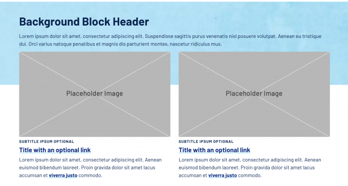
An alternate version of this block, called Background Block - Header is also available from the Content Layouts menu. This version looks the same but has extra space at the bottom. Any following content is pulled up to overlap the background. Not all content works on top of the background, so use this variation with caution.
Example
The screenshot below shows an example of the Background Block - Header layout with a following column block.

Header + Button Block
The Header + Button Block content layout consists of an editable text area, an optional yellow button link, and an editable background image overlaid with a decorative arrow. The background image automatically applies a blue overlay to create enough contrast with the white text.
Example
The screenshot below shows an example of the Background Block.

Note
These blocks are already “wide” layouts, so they will extend beyond the main content area without needing to use the Wide Block.
